First impressions matter. Studies show that we form an opinion of someone within two or three seconds of meeting them for the first time. Your essay’s first meeting with its assessor will be no different – they will begin the process of marking it before even reading a single word.
Follow these five simple presentation tips to give your essay a professional look that makes the right first impression:
One – Follow any style guides you have been given. It’s important that you work within the parameters set out by your school, college or university. This may be as simple as using a particular font, font size or line space, to more rigidly using a set document template, or detailed instructions on referencing. Whatever the style guide says – follow it. Not least because it proves you can read and are able to follow instructions!
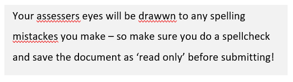
Two – No spelling or grammar mistakes! This may sound obvious, but please don’t forget to give your work a good proofread and hit the spellcheck button. Spelling or grammatical errors stand out like a sore thumb. Unless you are writing an English language essay, they might not directly cost you marks. But they will form a bad impression with your assessor – and we don’t want that!
Also consider how you are submitting your essay. Microsoft Word’s proofing software highlights grammatical errors automatically (the squiggly lines you see under words), creating an ugly track record of your mistakes. Even if you have corrected everything before submitting your essay, they could still show up on your assessor’s screen – for example, they may have their language setting in US English! You can avoid this by submitting in PDF (if allowed – check your style guide) or by ‘locking’ your Word document.
Three – Use call-out boxes, tables, graphs or pictures to break up text. This is a simple trick to bring more ‘life’ to your document. Think of how newspapers, magazines and websites use headlines, images, call-out boxes and different fonts on a single page. Having just plain text would look both weird and boring! Bring some of this thinking to how you set up each page to make your document more interesting to your assessor. Using call-out boxes, tables, graphs and pictures are important topics in their own right, so I’ll post a separate guide on each soon.
Four – Use descriptive headings and sub-headings that summarise the text in each section. Use a different font and size, or make them bold like I have on this page. Doing this breaks up the text to make it more aesthetically pleasing, whilst also allowing the assessor to quickly scroll through the document and get the ‘gist’ of it, and start their more detailed reading with a positive perception already formed!
I have used this technique in this guide – scroll through quickly and you can clearly see my five simple presentation tips! This is another important topic that deserves its own detailed post…..coming soon!
Five – Tidy up your document at the end before submitting, ensuring your content is well spaced on each page. If you don’t have a page limit, there is no need to ‘squash’ text. White space on your page is good and makes text easier to read.
You want your assessor to conclude a section positively before turning over and starting afresh – remember you’re trying to make this as easy as you can for them to award you marks. For example, I always try to avoid paragraphs straddling two pages. A table straddling two pages is also a big no-no! If you have started a new section or paragraph near the bottom of a page, why not drop it down onto the next page? Or edit your text back if you have a single line spilling onto the next page. Another trick is to adjust the size of any images or call out boxes to ‘fit’ your finalised text.
